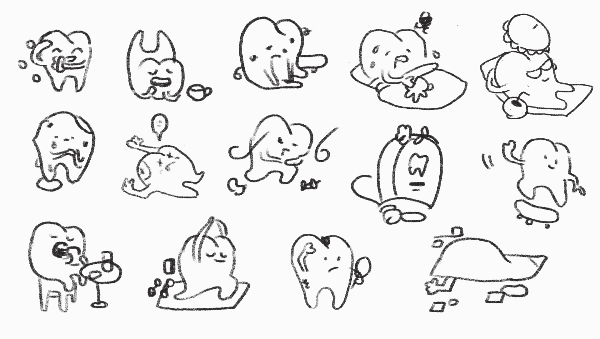
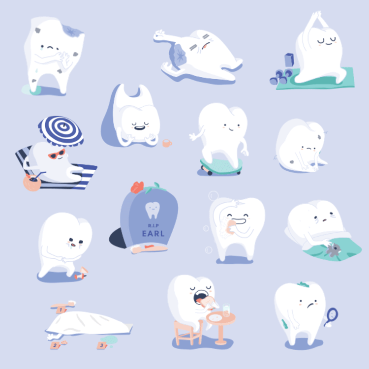
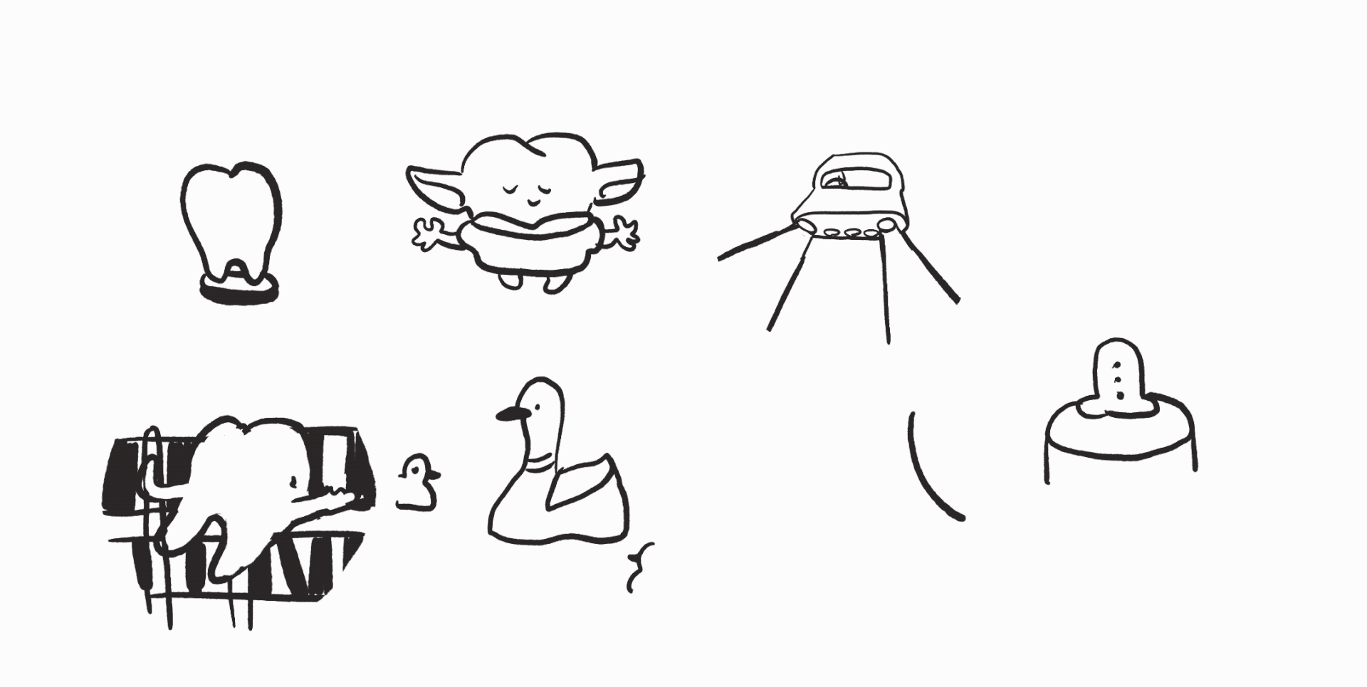
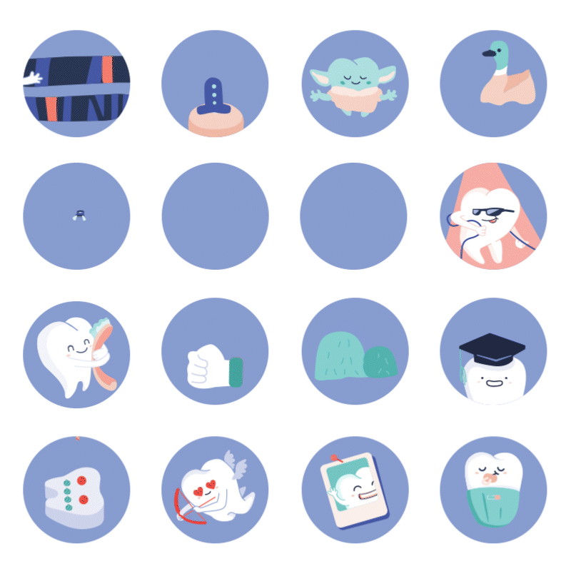
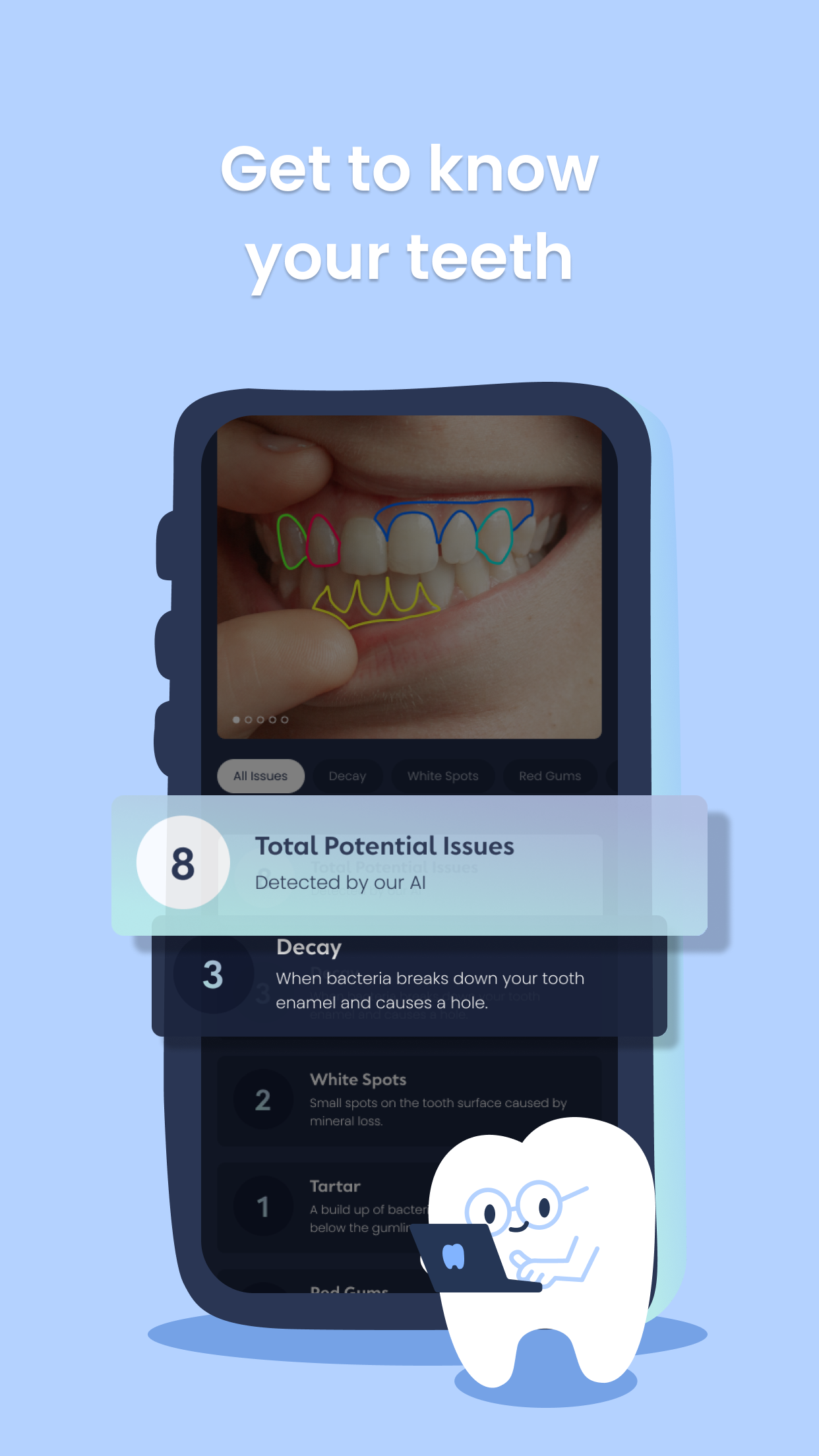
Mascot design
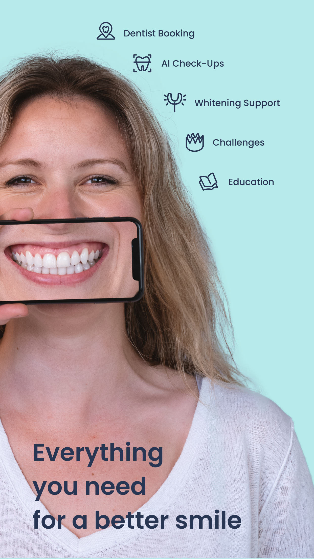
At the beginning of my time at Pearlii, my role as a creative designer was to create illustrations for the user interface, the educational content, social content, and a small portion of the animation.
Dental anxiety has been a concern for some people who fear to go dentist, and as a result, the oral issues worsen. Therefore a friendly, and marshmallowy mascot was born to Pearlii.
Being an active user of Duolingo, I was influenced by the gamification part of the app. Users are more engaged and to spend more time learning the language, just to earn a badge. Therefore I proposed to the team the animated badges idea.
UI Design
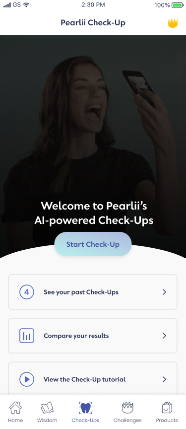
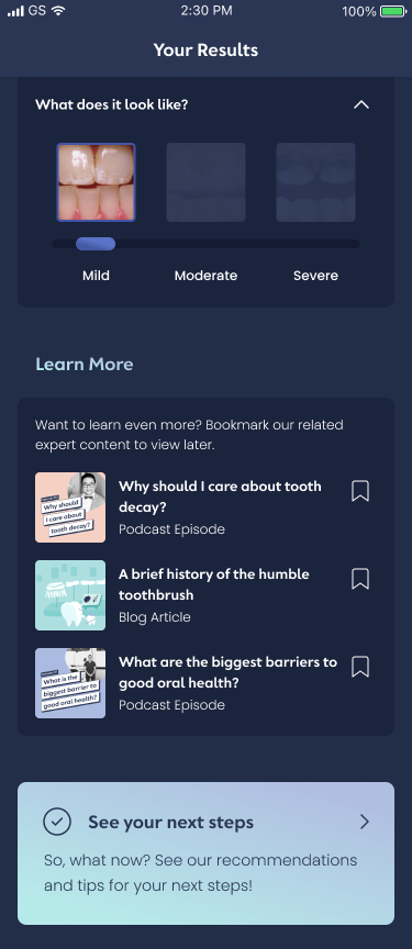
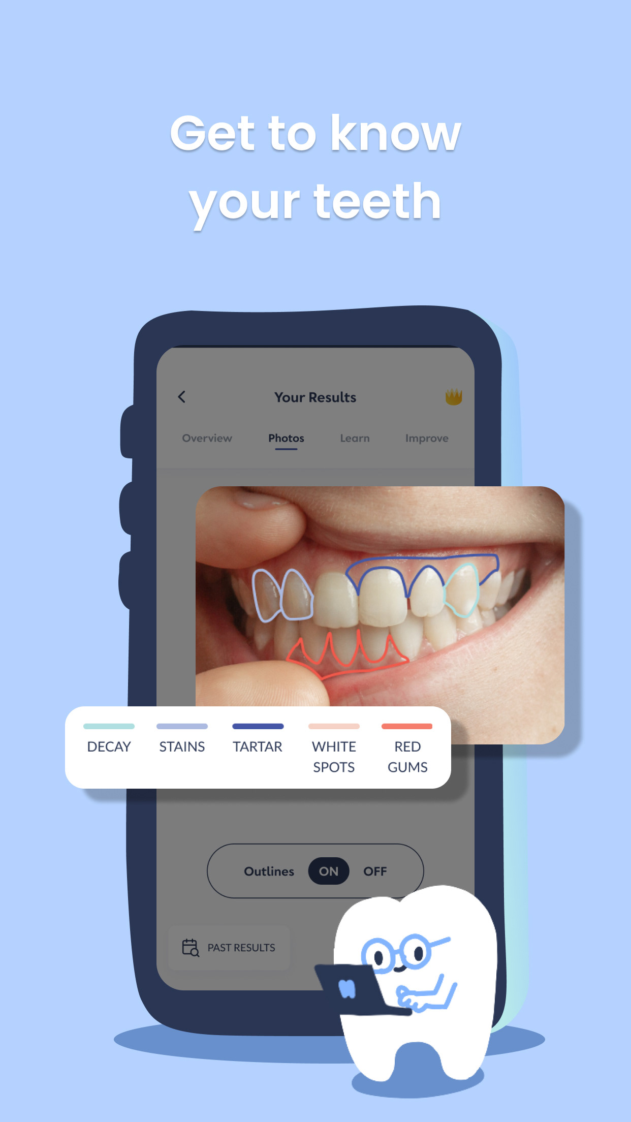
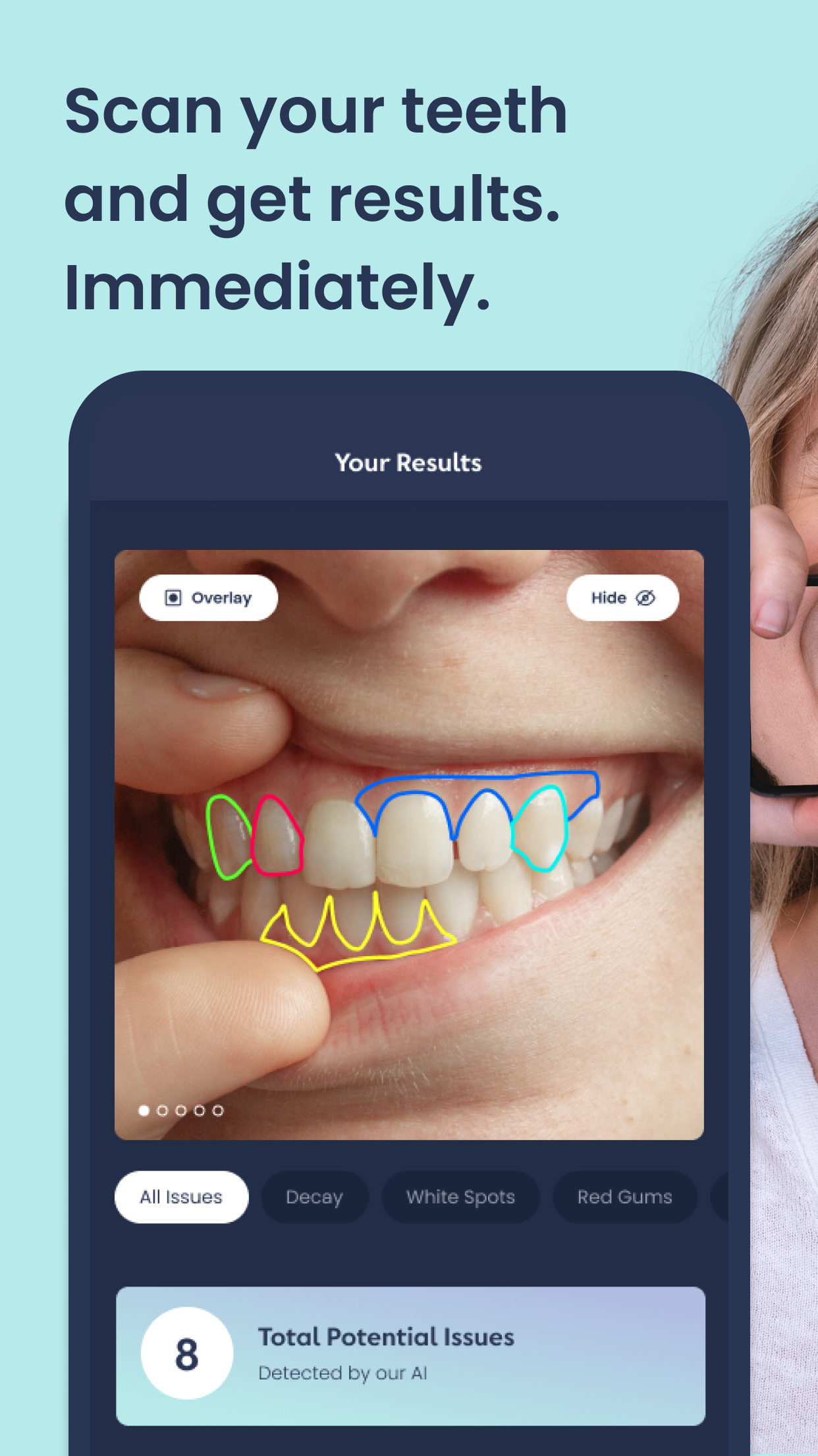
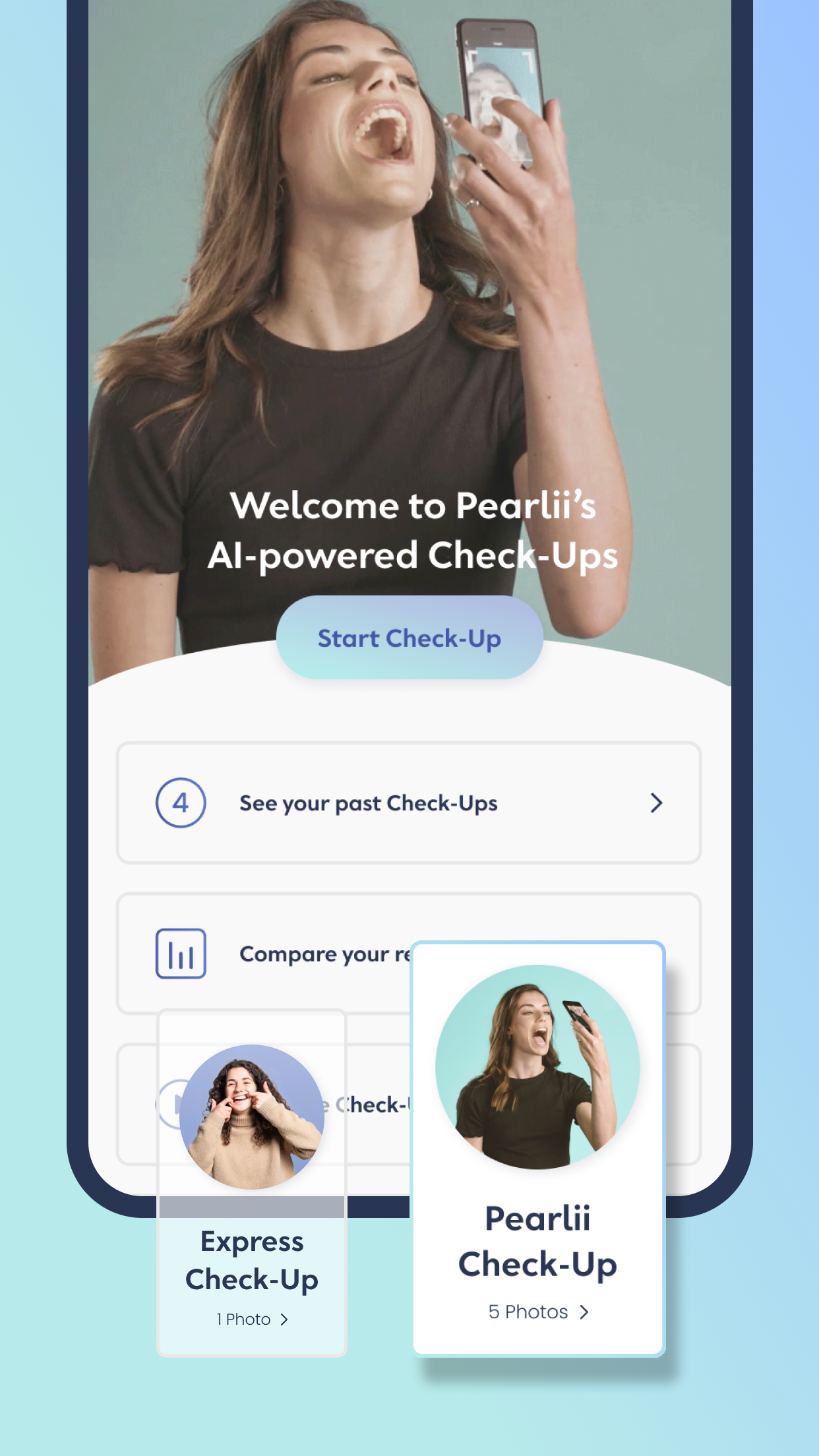
Like most app developers, we are constantly working on a newer version of the app to release. Luckily in App V3, I was allowed to give it a crack on UI. One of the challenges we were facing was users found the Check-Ups sections confusing, and it was such a pity because the technology we use is potentially a hook.
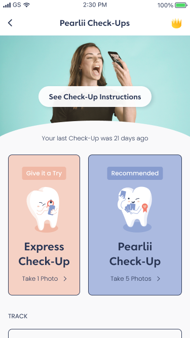
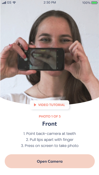
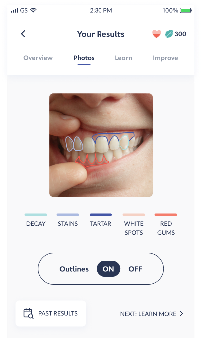
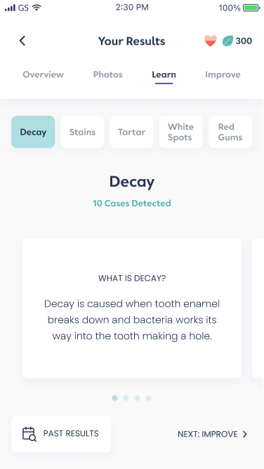
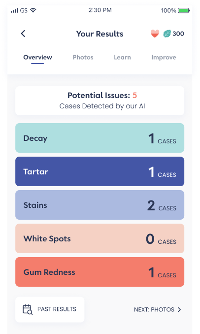
The problems in the earlier version are:
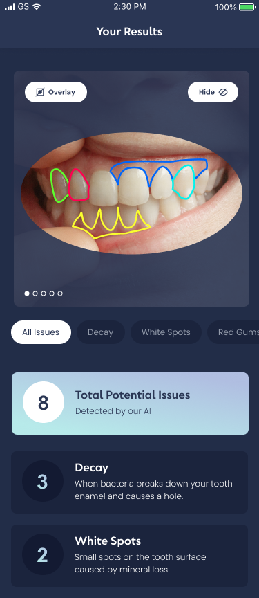
1. Too many colours - users are constantly making decision, and there is no clear path
2. The colour labels on the image are not clear - these may cause issues for colour-blind users
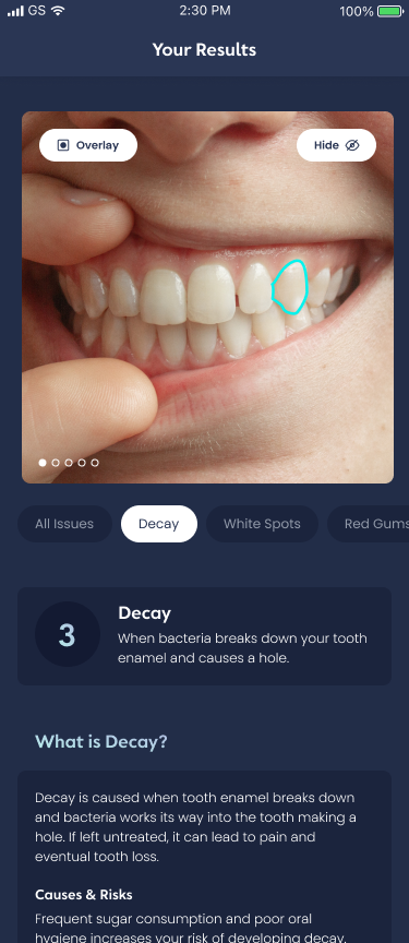
3. Some users may find confronting to look at their own mouth
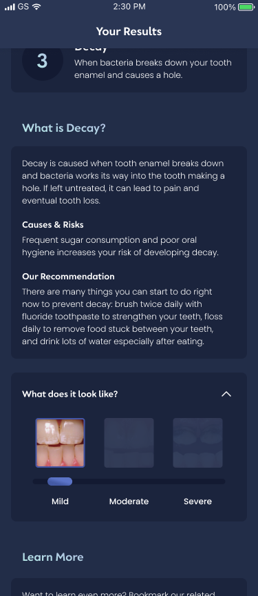
4. In user interviews, users responded that they want to know how severe their issue is
2. The colour labels on the image are not clear - these may cause issues for colour-blind users
3. Some users may find confronting to look at their own mouth
4. In user interviews, users responded that they want to know how severe their issue is
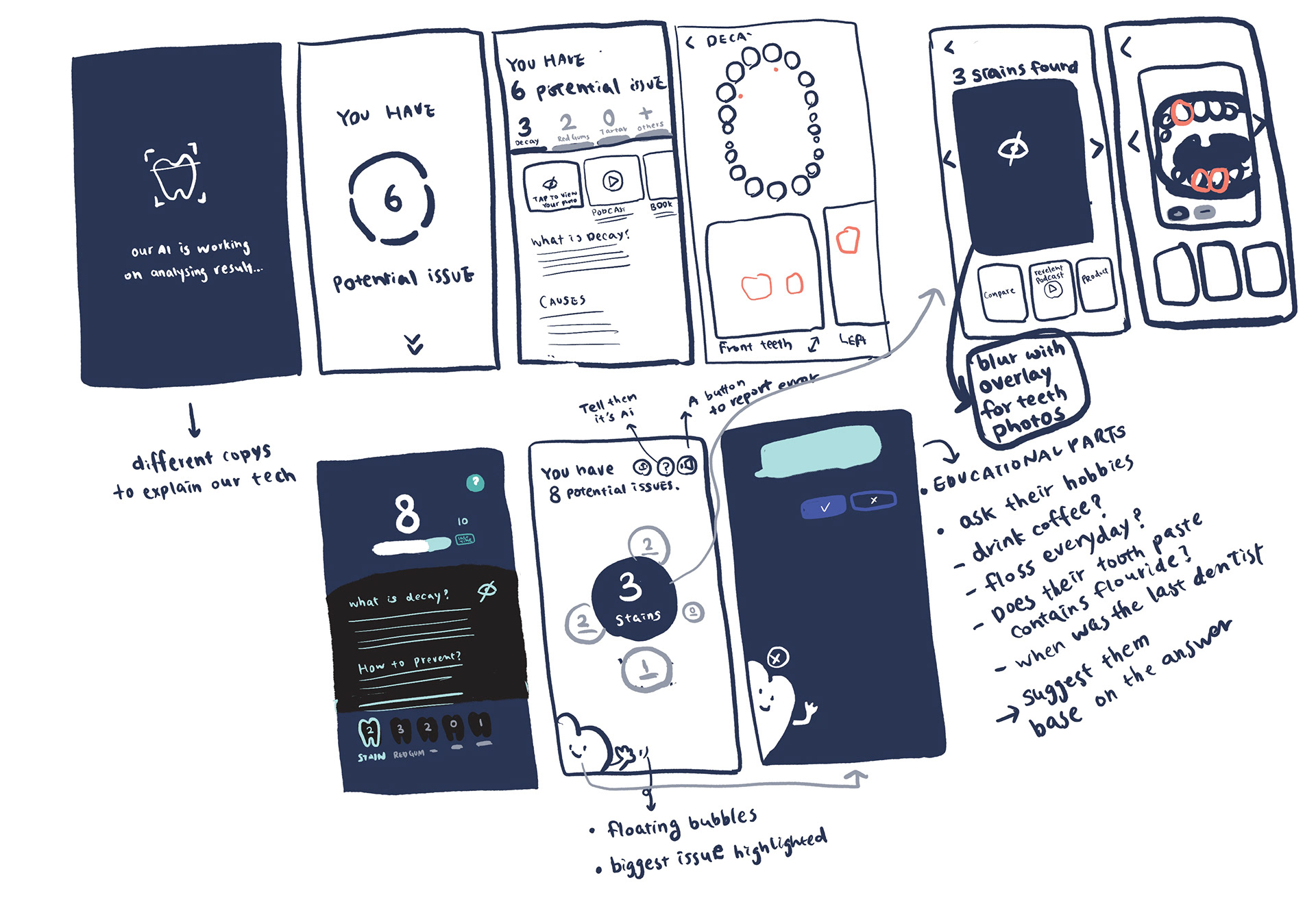
In this ideation process, the most efficient solution is, firstly, to reduce colour use, this way, not only we can create an effortless user journey, but also improve the memorability of branding. Secondly, enable users to viewviewing oral issues without seeing their mouth. Lastly, we should empower users to learn more about the diseases and to be alerted about the number of issues.
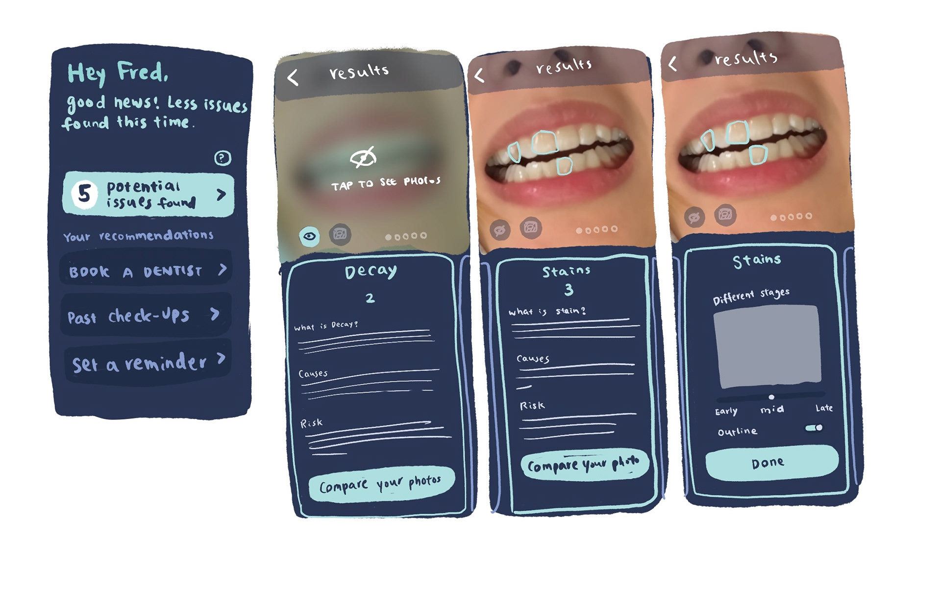
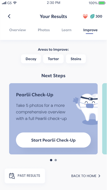
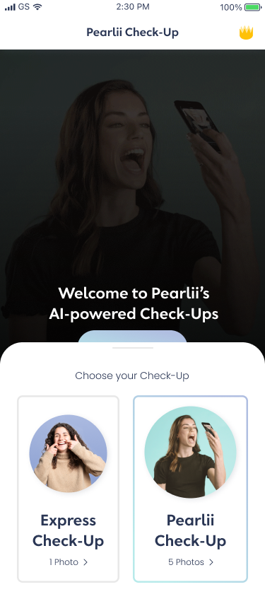
The high-fidelity designs on Figma:
Creative Asset on Google Play and App Store
I am obsessed with this new world of a/b testing on app stores. To get more divided results of a better creative asset, I worked with CTO to map out our testing plan, and we came up with variant icons, screenshots in portrait versus landscape orientation, and screenshots in a different style of device mockup. Where, I enjoy reading the metric, and observing the trend for a winning variation.

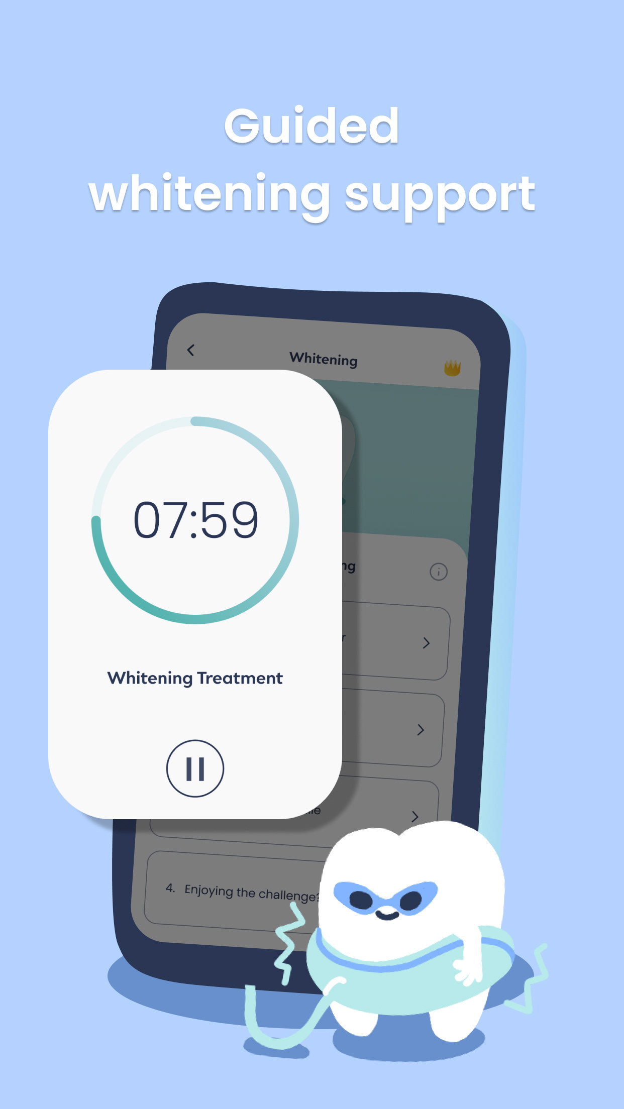
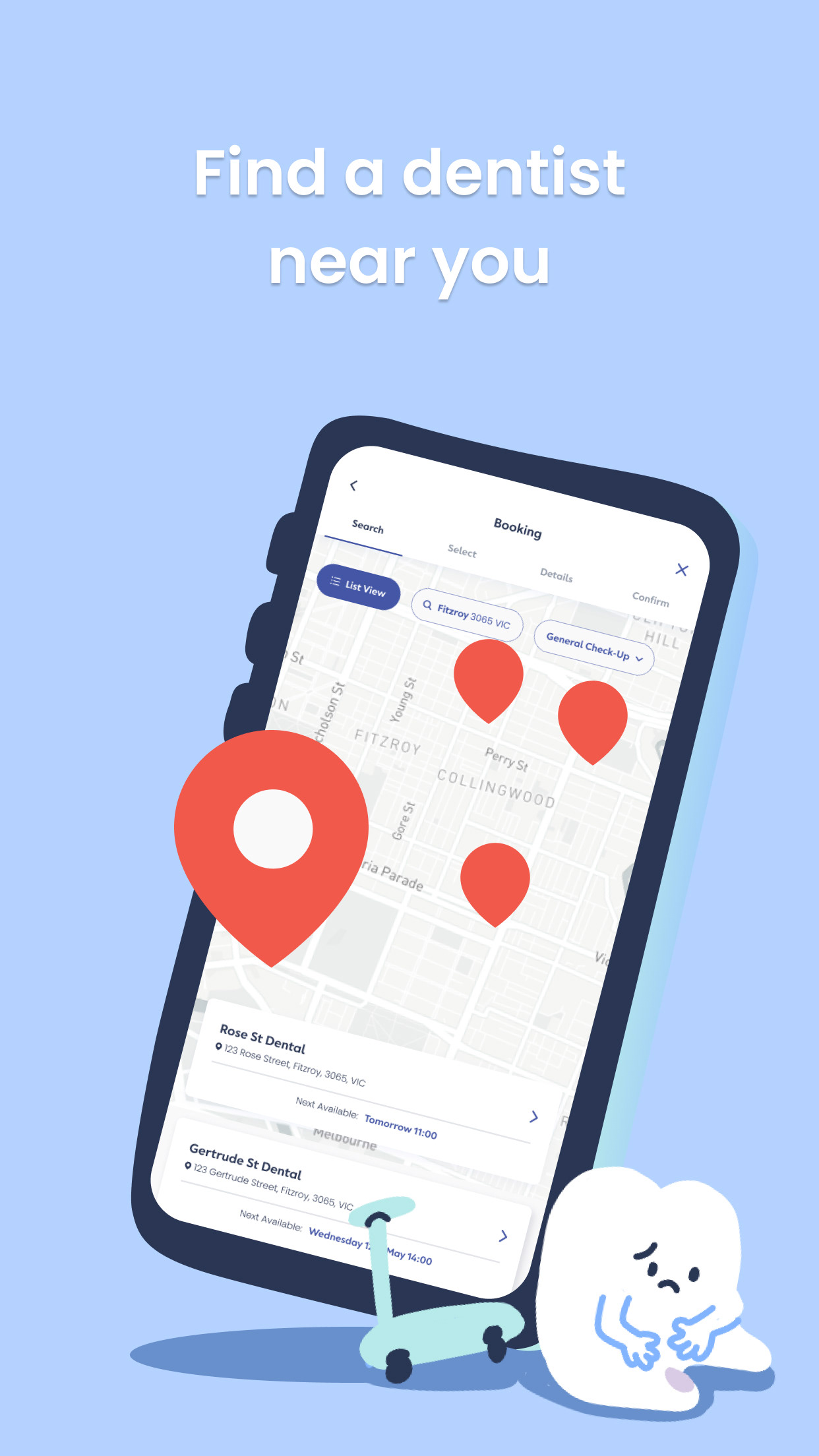
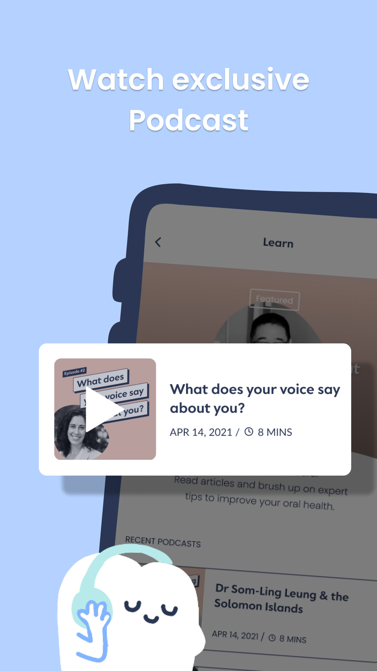
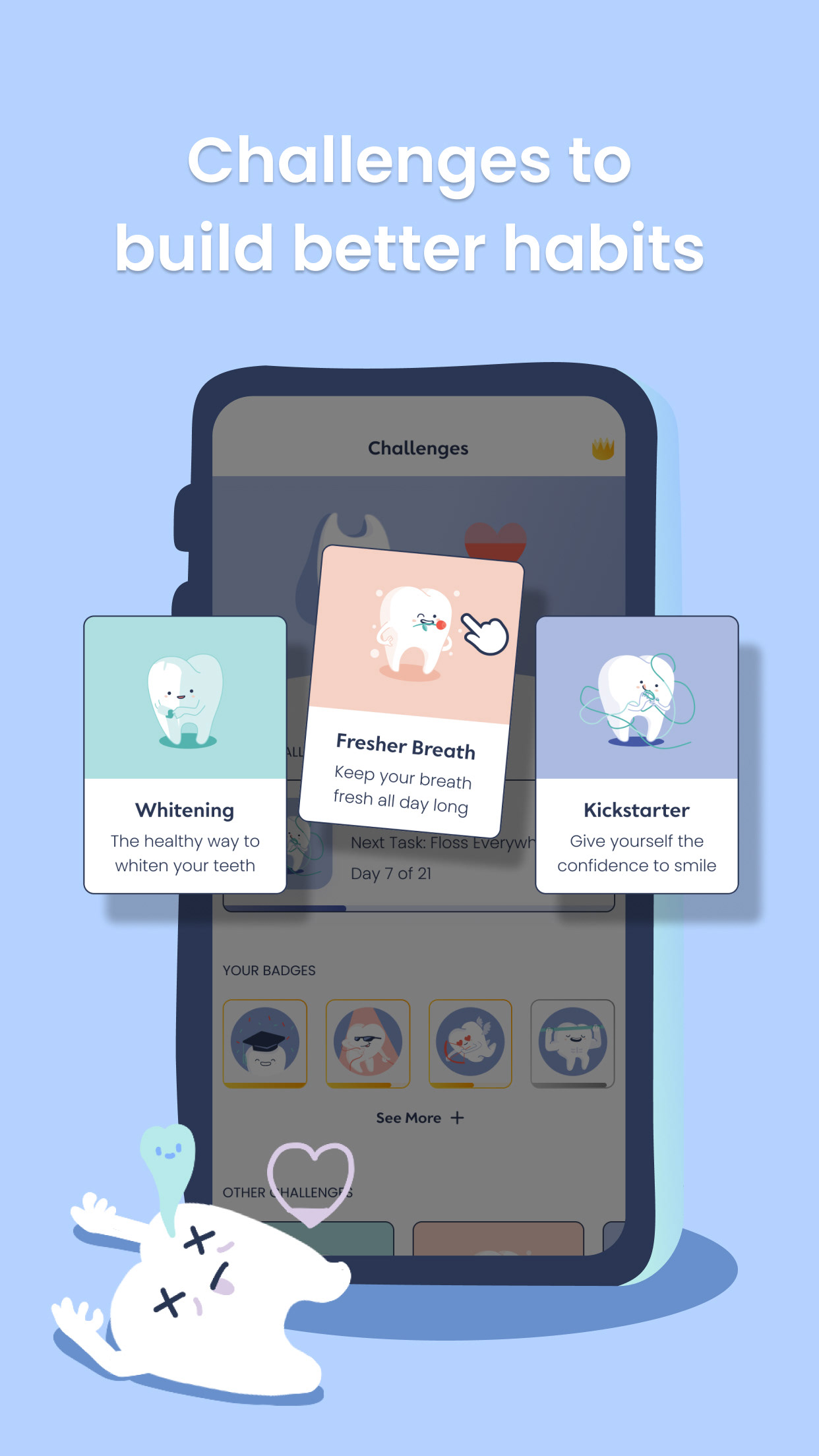
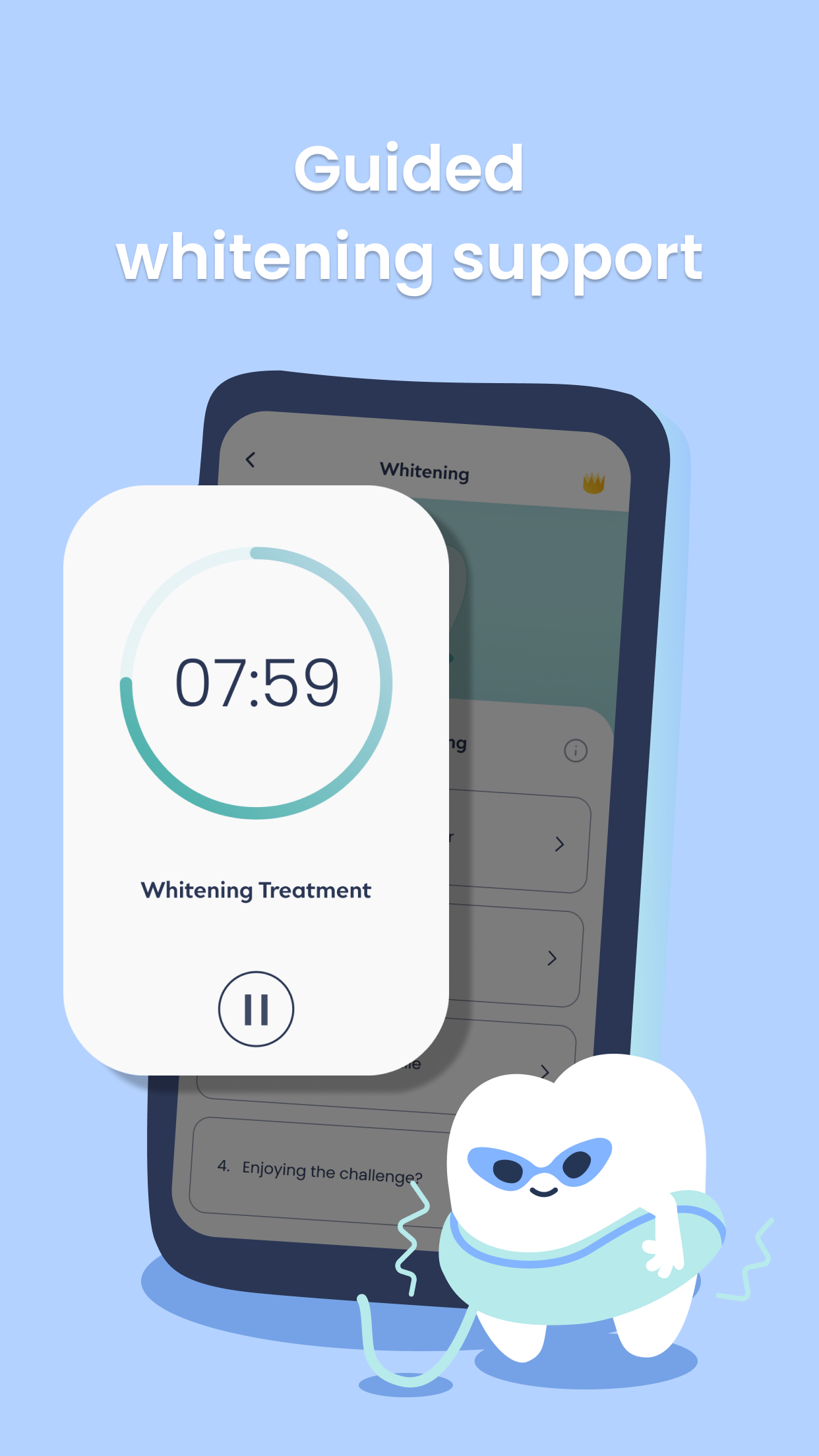
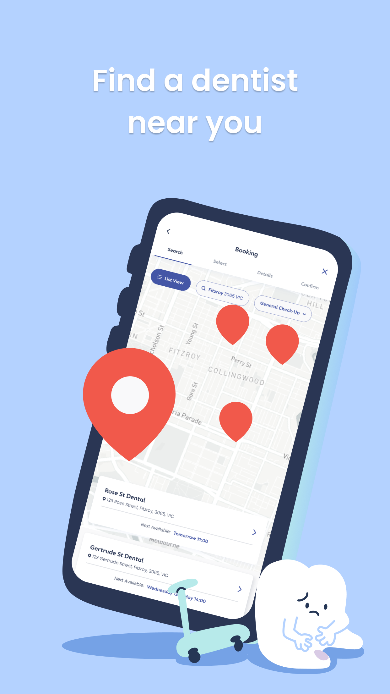
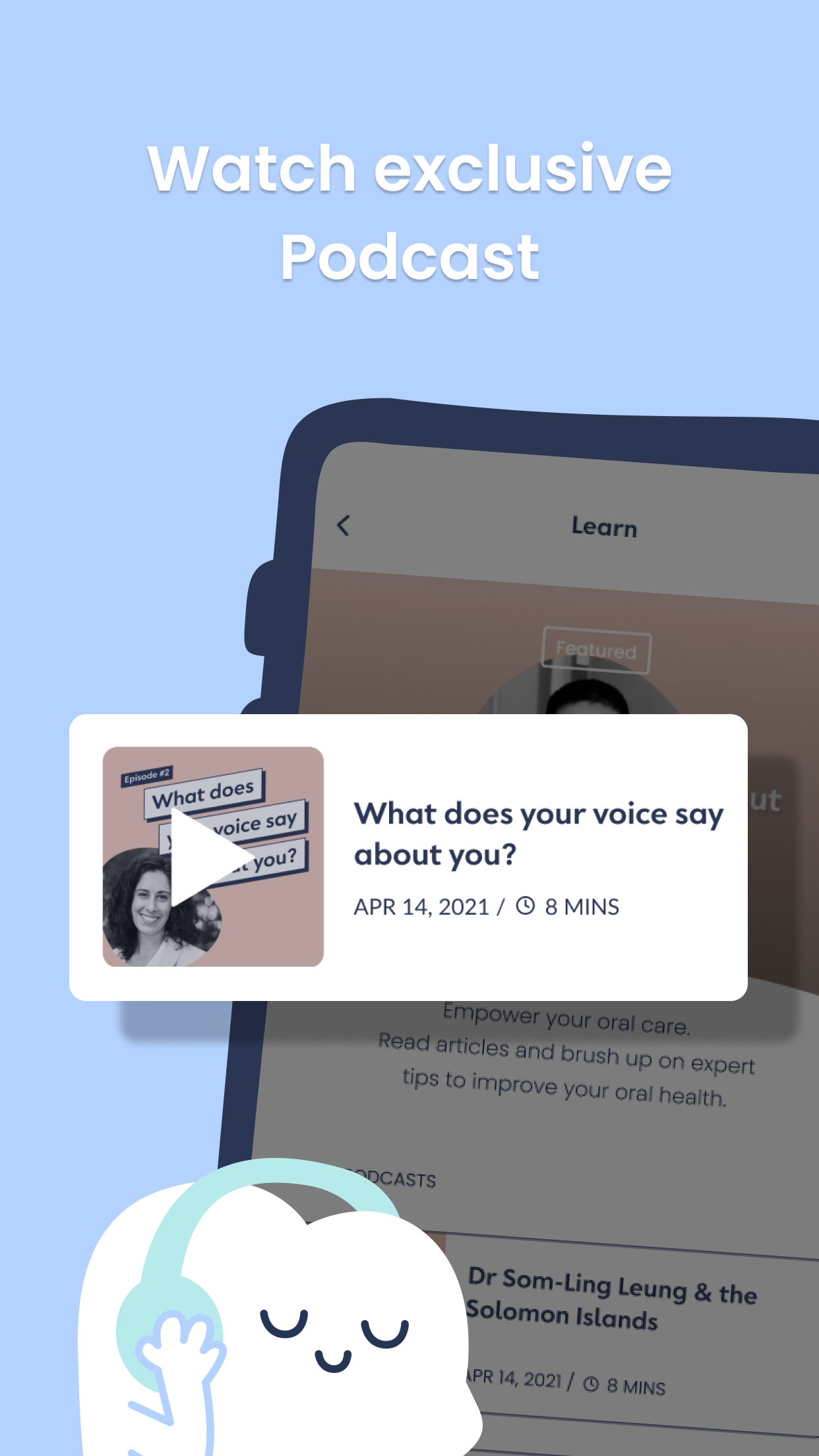
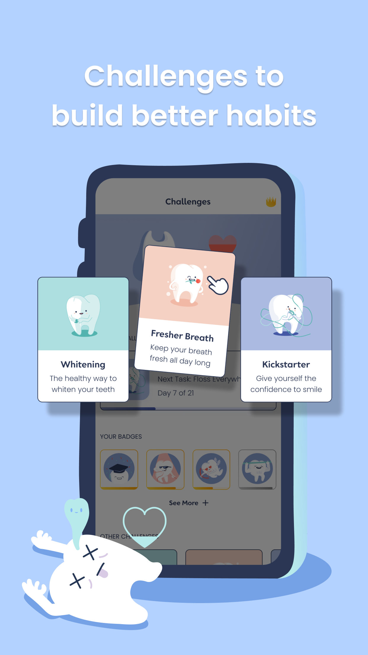
Design variants for a/b testing on Google Play Store